Examples
The following example will teach you how to create your first Obvia page, and will do so by showing you how to create a Todo list with a TextInput and Repeater component. Bear in mind that this guide assumes intermediate knowledge of Javascript, so if you you are totally new to web development, it might be a good idea to start with the basics.
Setting up your work area
The first step you should do is clone the Obvia framework in your PC from GitHub. If you are using XAMPP, it should be cloned in your htdocs folder. Ideally, the folder structure should look like this:
C:\xampp\htdocs\obviaSecondly, you should also create your project folder in htdocs. In this tutorial, we will create a folder called obvia-project. It should look like this:
C:\xampp\htdocs\obvia-projectWithin the folder, we will have to create the following:
- An HTML file, which I call ‘index.html’
- A JavaScript file, which I am calling ‘obvia.js’
- A CSS file in order to modify the style of the website, which I am calling ‘obvia.css’
- A folder that will contain the applets of our Obvia app, which I am naming ‘applets’
- A folder called ‘main’ within the ‘applets’ folder, which will contain our main applet
- Within ‘main’, we will have a JavaScript file called ‘main.js’ and a JSON file called ‘main.json’
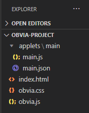
Once you are done, the structure of your project should look like this:
Your first steps with Obvia
Once the project structure is created, it is time to start writing code. You can the code of this project on GitHub and explore it more thoroughly, while this guide will explain the various functions and what they do. First of all, the first two files that need to be set up are index.html and obvia.js, as this is where the application is connected to the framework.
In obvia.js, you will find the following:
- initDP: the dataPromise function which should return the dataObject when resolved
- uiRoute: this function will decide where the view will go in the GUI on endDraw
- Then, you create the application, which finds its applets in the ‘main’ folder
var application = new App({
    applets: [{
        url: "/obvia-project/applets/main/",
        anchor: "main",
        dataPromise: _initDP,
        port: "viewStack",
        uiRoute: uiRoute,
    }, ],
    components: [{
        ctor: ViewStack,
        props: {
            id: "viewStack",
            type: ContainerType.NONE,
            components: [],
        },
    }, ],
});
In the end, the data should be loaded before calling renderPromise so that the current applet (the one in the url) implementation can access it.
application.render().then(function(cmpInstance) {
    $(document.body).append(cmpInstance.$el);
});
After this is done, we can focus our attention on index.html. Here, most of the scripts and css stylesheets should be derived directly from the framework, so you can copy and paste most of the code. All you have to do is beware of the basepath, so that it is actually written correctly and finds the right folder. Once this is done, it is time to focus on the applet.
Working with the applet
As you have seen in the structure above, there is a folder ‘main’ within the ‘applets’ folder, and inside it we have two files: main.js and main.json. In Obvia, the DOM is conceived as a JSON file, rather than HTML, and everything is built from the components. To illustrate this, we will first start by drawing the text input. This is how the JSON file should look for that:
{
    "ctor": "Container",
    "props": {
        "components": [{
            "ctor": "TextInput",
            "props": {
                "value": "",
                "placeholder": "What needs to be done?",
                "type": "text",
                "autocomplete": "off",
                "components": [],
                "sortChildren": false,
                "guid": "1",
                "id": "textField",
                "index": 0,
                "spacing": {},
                "attr": {
                    "isCmp": true
                },
                "css": {},
                "visible": true,
                "enabled": true,
                "draggable": true,
                "classes": ["todo-input"]
            }
        }],
        "sortChildren": false,
        "guid": "1",
        "id": "workAreaColumn",
        "index": 0,
        "spacing": {
            "h": 100
        },
        "css": {},
        "visible": true,
        "enabled": true,
        "classes": ["border", "col"],
        "parentType": "row"
    }
}
Here, you can notice that we start with a Container, and within this Container we actually create our TextInput component, with a placeholder value of “What needs to be done?” and an id of “textField”. Notice that I have also put “todo-input” in the classes, as this will be useful later when working on the styke. In order to view this in our browser, we also need to write the code for our main.js file. This is how to do it:
let Implementation = function(applet) {
    let app = applet.app;
    let data = applet.data;

    let imp = {
        "BEGIN_DRAW": async function(e) {},

        "END_DRAW": function(e) {},

    };
    return imp;
};

Implementation.ctor = "Implementation";
export {
    Implementation
};
Once this is done, you can use your browser to go to http://localhost/obvia-project/index.html (or however your url goes depending on your folder structure) and you shall see the following:
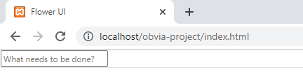
Your text input is ready
Once this is done, all you have to do is work on the CSS file to change the style of the text input however you want. Go to obvia.css and write the following:
.todo-input {
    width: 30%;
    display: block;
    margin-left: auto;
    margin-right: auto;
    padding: 5px 0px;
    text-align: center;
    font-size: 16px;
    margin-top: 40px;
    margin-bottom: 16px;
}
Now, your text input will look much better. Maybe you might need to empty your cache and do a hard reload to see it.
Creating your first behavior
Although you have created the text input in the DOM, it still does not do anything at all. In order to actually make the component do something, we need to give it some functionality using behaviors. That is done in the “END_DRAW” function. The first thing we need to do is declare a global variable for the text input (let searchForm) and the title of the eventual todo (let toDoTitle), then inside the “END_DRAW” function. This is how it should look:
searchForm = applet.view.find("textField");
applet.addBehaviors(
    searchForm, {
      keyup: {
        ADD_TODO: {
        filter: KeyboardUtils.test["ENTER"],
                 },
           },
      },
     false
  );
After “END_DRAW” and before “return imp”, write the following:
"ADD_TODO": function(e) {
            toDoTitle = e.target.value;
            if (toDoTitle.trim()) {
                console.log(toDoTitle);
            }
            e.target.value = "";
}
Basically, what we have done here is that we have given a behavior to the applet, and specifically its textField component. Once the key ENTER is pressed on the text field, it calls the ADD_TODO function. Later we will use this function to add todos to our list, but for now, we will just print the text out using console.log. Once the text is printed out, the value of the text in the text field goes back to an empty string. This is how it should look like in your browser
Working with the repeater
The repeater is one of the most interesting components of Obvia, as it allows you to multiply other components. Whenever you have a component that you need to reuse several times, you can put it inside a repeater component. Since we need to have several todos, we should put all of them inside a repeater, which shall serve as our todo list. So, as a next step, you should go to the json file and create a repeater after the TextInput component.
{
            "ctor": "Repeater",
            "props": {
                "rendering": {
                    "direction": "vertical",
                    "separator": false,
                    "wrap": true,
                    "mode": "append"
                },
                "dataProvider": [],
                "components": [{
                    "ctor": "Label",
                    "props": {
                        "labelType": "label",
                        "label": "{?title}",
                        "components": [],
                        "sortChildren": false,
                        "guid": "5ce9b5d5-a60a-4508-b0a4-9841795cec3e",
                        "id": "todo",
                        "index": 0,
                        "spacing": {},
                        "attr": {
                            "isCmp": true
                        },
                        "css": {},
                        "visible": true,
                        "enabled": true,
                        "draggable": true,
                        "classes": ["todo"]
                    }
                }],
                "sortChildren": false,
                "guid": "40ce3472-1cac-4271-93e5-024488016ead",
                "id": "todolist",
                "index": 0,
                "spacing": {},
                "attr": {
                    "data-triggers": "rowAdd rowEdit beforeRowAdd rowDelete beforeRowDelete dataProviderLengthChanged",
                    "isCmp": true
                },
                "css": {},
                "visible": true,
                "enabled": true,
                "draggable": true,
                "classes": ["todo-list"]
            }
        }
To explain the code above, we are basically creating a Repeater component, which inside itself holds Label components. Each of our labels represents one todo, and the repeater represents the whole list. The label title is taken via binding (in curly brackets) from the dataProvider. As the name suggests, the dataProvider is what gives the data to the Repeater. Data in the dataProvider can come in two forms: as an ArrayEx or as a URL. In our case, we can give it an array of objects. Fir example:
"dataProvider": [{ "id": 0, "title": "Learning web development"}]If you go to the browser and refresh, you will see that you have the first todo in your list.
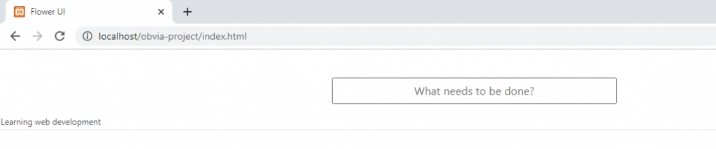
Your first todo
Once again, all the style changes you have to do here go in obvia.css. As you can see from the code snippet above, I am using the classes “todo” and “todo-list” for the Label and Repeater components respectively.
Adding todos to the list
Now that we have our text input and our todo list, it is time to configure our app so that what we write in the text input is actually shown in the todo list. We have already given the behavior to the text input, now all we have to do is edit the function “ADD_TODO” so that it adds a new todo to the list. First of all, add the following global variables in the beginning of main.js:
let toDoList;
let toDoId = 1;
let toDo;
As you can probably guess from the TextInput example above, we have to write the following on “END_DRAW”, so that our toDoList becomes our Repeater component:
toDoList = applet.view.find("todolist");toDoId, along with toDoTitle, are the variables we need to create the toDo object that will eventually be sent to the list. Inside the “ADD_TODO” function, replace “console.log(toDoTitle)” with the following code snippet.
   toDo = {
        id: toDoId,
        title: toDoTitle,
    };
    console.log(toDo);
    toDoList.dataProvider.splice(toDoList.dataProvider.length, 0, toDo);
    toDoId++;
Furthermore, you can remove the object we created in the dataProvider of the JSON file, as we do not need it anymore. Once we’ve done all this, you’ll be able to visualize everything you write in the text input as a todo.
Adding the buttons
Now that the list is ready, we can add buttons to it. The first thing I will add is a button to mark if a todo is done or not. As this needs to be repeated for every todo item, it will also be added in the repeater. Basically, we will add a Button component before the Label component. It will look like this:
{
            "ctor": "Button",
            "props": {
                "label": "☐",
                "type": "button",
                "components": [],
                "sortChildren": false,
                "id": "addbutton",
                "index": 0,
                "spacing": {},
                "attr": {
                         "isCmp": true
                    },
                          "css": {},
                          "visible": true,
                          "enabled": true,
                          "draggable": true,
                          "classes": ["addbutton"]
            }
  },
As you can see, the button will be labeled with an empty square box ☐, which can be ticked once you click on it. Furthermore, we can use CSS to edit the style. In my case, I am using the class “addbutton” for this button. Once you are done with these steps, when you add a new todo in your list, it should look similar to this:
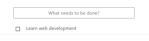
Your todo with a button
Now we need to add a behavior to the button. However, here we have a small distinction from the behavior implementation for the text input, as we want to extent the behavior even to todo items that will be created in the future. Therefore, we need to make sure that whenever a new todo item is added to the list, a behavior is added to its button. First, we need to add the following function inside “END_DRAW”:
applet.addBehaviors(
        toDoList, {
            "rowAdd": "PREPARE_COMPONENT"
        });
This basically says that whenever a new row is added to the list of todos, the function “PREPARE_COMPONENT” will be triggered, and this is the function in which the behavior will be implemented. Now, you have to go after the “ADD_TODO” function and paste the following:
"PREPARE_COMPONENT": function(e, r, ra) {
    if (ra) {
        applet.addBehaviors(ra.currentRow.addbutton, {
            "click": {
                "CLICK_TODO": {
                    onPropagation: true
                      }
                  }
              });
    }
},

"CLICK_TODO": function(e) {
    console.log(e.target.textContent);
    if (e.target.textContent == "☐") {
        e.target.textContent = "☒";
    } else {
        e.target.textContent = "☐";
    }
}
So, what happens here is that whenever we click a button, if it is empty ☐, it will be marked with a cross ☒, and vice versa. Depending on your CSS modifications, it should look somewhat similar to this:
You can check this example in Github, under the folder name Todo-App in examples. We recommend that, in order to understand the process, you try to create a button that deletes the Todo from the list.