Components
Amount Component
The Amount Component accepts as an input from the user a monetary value. This component has two main parts: the main part is a textfield in which the user can put the monetary value and the second part in which the user can put the type of the currency.
- Amount
- Properties
- Example
- JSON

- Name or id: used to reference the component.
- Label: used to give the component a name.
- Visible: toggles the component's visibility in the browser.
- Enable: toggles the component's modifiability by the user.
- Required: checks if the data must be completed before being sent for further processing.
- Colspan, Spacing: determine the appearance and position of the component.
var myAmount = new Amount({
id: 'amount',
label: 'Payment',
blockProcessAttr: false,
currency: [{ "id": "1", "text": "EUR" }, { "id": "2", "text": "ALL" }, { "id": "3", "text": "GBP" }],
value: {
"amount": "132323",
"currency": "1"
}
AutoComplete Component
The AutoComplete component enables the user to make more than one choice from a list of alternatives. AutoComplete is made up of an input field in which the user can click and at the click of the button, it displays a drop-down list from which the user can select an item to display.
- AutoComplete
- Properties
- Example
![]()
- Name or id: used to reference the component.
- Label: used to give the component a name.
- Visible: toggles the component's visibility in the browser.
- Enable: toggles the component's modifiability by the user.
- Required: checks if the data must be completed before being sent for further processing.
- Colspan, Spacing: determine the appearance and position of the component.
- Multiple Selection: allows the choice of multiple items.
- DataProvider: fills the component with data.
var myAutoComplete = new AutoComplete({
id: 'autocomplete',
label: 'Employees',
blockProcessAttr: false,
multipleSelection: true,
displayTable: true,
valueField: "value",
labelField: "employee",
tableData: [["John Doe"], ["Rob Smith"], ["Harry Johnes"]],
dataProvider: [{ "value": "1", "employee": "John Doe" }],
value: [{ "value": "1", "employee": "John Doe" }]
});
Button Component
The button component is quite simple and flexible, as it allows the user to add a button on the web app. Obvia allows three different button types: button, submit, and reset.
- Button
- Properties
- JSON

- Name or id: used to reference the component.
- Label: used to give the component a name.
- Visible: toggles the component's visibility in the browser.
- Enable: toggles the component's modifiability by the user.
- Required: checks if the data must be completed before being sent for further processing.
- Colspan, Spacing: determine the appearance and position of the component.
CheckBox Component
CheckBox is a simple component made up of a single clickable box, representing an option. A combination of them forms a CheckBoxGroup. Using this component is a good option when you want to give users the ability to select or deselect one option.
- CheckBox
- Properties
- Example
- JSON

- Name or id: used to reference the component.
- Label: used to give the component a name.
- Visible: toggles the component's visibility in the browser.
- Enable: toggles the component's modifiability by the user.
- Required: checks if the data must be completed before being sent for further processing.
- Colspan, Spacing: determine the appearance and position of the component.
- Value: selects the value of the component, whether or not the box should be filled.
var myCheckBox = CheckBox({
id: 'checkBoxField',
label: 'CheckBox Label',
versionStyle: '',
blockProcessAttr: false,
value: "1",
enabled:true,
checked:false
});
{
"ctor": "CheckBox",
"props": {
"label": "CheckBox Label",
"value": "1",
"guid": "1",
"id": "checkBox",
"index": 0,
"spacing": {},
"attr": {
"isCmp": true
},
"css": {},
"visible": true,
"enabled": true,
"draggable": true,
"classes": []
}
}
CheckBoxGroup Component
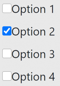
CheckBoxGroup is a component made up of smaller units known as CheckBox. A check box represents a single option and their combination forms a CheckBoxGroup. Using this component is a good option when you want to give users the ability to select a few options from a possible set of choices.
- CheckBox
- Properties
- Example
- JSON
- Name or id: used to reference the component.
- Label: used to give the component a name.
- Visible: toggles the component's visibility in the browser.
- Enable: toggles the component's modifiability by the user.
- Required: checks if the data must be completed before being sent for further processing.
- Colspan, Spacing: determine the appearance and position of the component.
- DataProvider: fills the component with data.
var myCheckBox = CheckBox({
id: 'checkBoxField',
label: 'CheckBox Label',
versionStyle: '',
blockProcessAttr: false,
value: "1",
enabled:true,
checked:false
});
Color Component
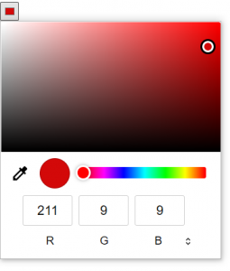
Color is a component that allows the user to select a color through different means. The user can either input the right RGB numbers, select the right color shade in the spectrum, or use a color picker to pick any color from the window.
- Color
- Properties
- JSON
- Name or id: used to reference the component.
- Visible: toggles the component's visibility in the browser.
- Enable: toggles the component's modifiability by the user.
- Required: checks if the data must be completed before being sent for further processing.
- Colspan, Spacing: determine the appearance and position of the component.
{
"ctor": "Color",
"props": {
"components": [],
"sortChildren": false,
"guid": "1",
"id": "color",
"index": 0,
"spacing": {},
"attr": {
"isCmp": true
},
"css": {
"width": "20px",
"height": "20px"
},
"visible": true,
"enabled": true,
"draggable": true,
"classes": []
}
}
Date Component
The Date component gives the user the opportunity to input a date using the date-picker element. This component is made up of two main parts: an input field and a date-picker element. The user can enter his input by manually filling the input field with a formatted date in the Day / Month / Year format or can click on this field. The click enables the display of the date-picker element, which is nothing other than a calendar from which the user selects the date. The selected date will be displayed on the input field.
- DateTime
- Properties
- Example
- JSON

- Name or id: used to reference the component.
- Label: used to give the component a name.
- Visible: toggles the component's visibility in the browser.
- Enable: toggles the component's modifiability by the user.
- Required: checks if the data must be completed before being sent for further processing.
- Colspan, Spacing: determine the appearance and position of the component.
- Input/Output Format: specifies the format of the date, which can be DD/MM/YYYY, YY/MM/DD or MM/DD/YY.
var myDate = new DateTime({
id: 'datetime',
label: 'Date',
versionStyle: '',
blockProcessAttr: false,
inputFormat: 'DD/MM/YYYY',
outputFormat: 'DD-MM-YYYY',
displayFormat: 'MM/DD/YYYY',
value: '2020/02/04'
});
DateTimeCombo Component
The DateTimeCombo component is designed in such a way as to give the user the ability to enter as input a clock or date. The clock is formatted in the Hour/Minute/Seconds format. The user can define each clock component by using a drop-down list that selects the hour (0-23), minutes (0-59) and seconds (0-59). The date can be formatted in three ways Day/Month/Year, Month/Day/Year, Year/Month/Days. Each Date component can be selected from a drop-down list: Day (1-31), Month (1-12), Year (1900-2099).
- DateTimeCombo
- Properties
- Example
- JSON
![]()
- Name or id: used to reference the component.
- Label: used to give the component a name.
- Visible: toggles the component's visibility in the browser.
- Enable: toggles the component's modifiability by the user.
- Required: checks if the data must be completed before being sent for further processing.
- Colspan, Spacing: determine the appearance and position of the component.
- Input/Output Format: specifies the format of the date, which can be DD/MM/YYYY, YY/MM/DD or MM/DD/YY.
var myDayMonthYear = new DateTimeCb({
id: 'dayMonthYear',
label: 'Date Mode 2',
versionStyle: '',
blockProcessAttr: false,
mode: "date", //datetime, time
inputFormat: 'DD/MM/YYYY',
outputFormat: 'DD-MM-YYYY',
value: '10/10/2010'
});
Image Component
The image component allows the user to put an image in the website. The user can put the image in through its url, and can also input the height and width of the image.
- Image
- Properties
- JSON

- Name or id: used to reference the component.
- Src: used for the URL of the image.
- Visible: toggles the component's visibility in the browser.
- Enable: toggles the component's modifiability by the user.
- Required: checks if the data must be completed before being sent for further processing.
- Colspan, Spacing: determine the appearance and position of the component.
- Height: input the height of the image.
- Width: input the width of the image.
- Alt: give a name to the image.
Label Component
Label is one of the simplest and most versatile components, so it can be used almost anywhere. In its simplest form, it is just a short text.
- Label
- Properties
- Example
- JSON

- Name or id: used to reference the component.
- Label: used to give the component a name.
- Visible: toggles the component's visibility in the browser.
- Enable: toggles the component's modifiability by the user.
- Required: checks if the data must be completed before being sent for further processing.
- Colspan, Spacing: determine the appearance and position of the component.
- labelType: allows the user to select the type of label.
{
"ctor": "Label",
"props": {
"labelType": "label",
"label": "This is a label",
"components": [],
"sortChildren": false,
"guid": "1",
"id": "label",
"index": 0,
"spacing": {},
"attr": {
"isCmp": true
},
"css": {},
"visible": true,
"enabled": true,
"draggable": true,
"classes": []
}
}
Map Component
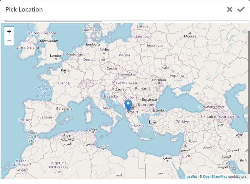
Map is a component that allows users to select a geographic location that will then appear on the map using a Marker Type component.
- Map Location
- Properties
- Example
- JSON
- Name or id: used to reference the component.
- Label: used to give the component a name.
- Visible: toggles the component's visibility in the browser.
- Enable: toggles the component's modifiability by the user.
- Required: checks if the data must be completed before being sent for further processing.
- Colspan, Spacing: determine the appearance and position of the component.
var myMap = new GoogleMap({
id: 'map',
label: 'Geographic Location',
versionStyle: "",
blockProcessAttr: false,
value: {
latitude: 41.1533,
longtitude: 20.1683,
zoomLevel: 7 }
});
RadioGroup Component
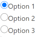
Radio Group is a component composed of smaller units known as Radio Buttons. A radio button represents a single option and the combination of several radio buttons forms a RadioGroup. RadioGroup allows the user to choose a single option from a set of options which makes it ideal for gender and status options as one person may have only one.
- RadioGroup
- Properties
- Example
- Name or id: used to reference the component.
- Label: used to give the component a name.
- Visible: toggles the component's visibility in the browser.
- Enable: toggles the component's modifiability by the user.
- Required: checks if the data must be completed before being sent for further processing.
- Colspan, Spacing: determine the appearance and position of the component.
- DataProvider: fills the component with data.
var myTextarea = new TextArea({
id: 'textarea',
label: 'Textarea Label',
versionStyle: '',
blockProcessAttr: false,
spellCheck: {
defaultDictionary: 'English',
},
value: ''
});
TextArea Component
This component is composed of two parts. Initially, TextArea specifies a multi-line input field in which the user can enter an unlimited number of characters. The second part of this component is the SpellCheck button, which identifies spelling errors in the text entered as input by the user.
- TextArea
- Properties
- Example
- JSON

- Name or id: used to reference the component.
- Label: used to give the component a name.
- Visible: toggles the component's visibility in the browser.
- Enable: toggles the component's modifiability by the user.
- Required: checks if the data must be completed before being sent for further processing.
- Colspan, Spacing: determine the appearance and position of the component.
- Spell Check: the Spell Check button shows us a list of options in order to select the grammar in which we want to make the correction right.
var myTextarea = new TextArea({
id: 'textarea',
label: 'Textarea Label',
versionStyle: '',
blockProcessAttr: false,
spellCheck: {
defaultDictionary: 'English', },
value: ''
});
TextInput Component
TextInput Component specifies an input field with a text input line in which the user can input data.
- TextInput
- Properties
- Example
- JSON
![]()
- Name or id: used to reference the component.
- Label: used to give the component a name.
- Visible: toggles the component's visibility in the browser.
- Enable: toggles the component's modifiability by the user.
- Required: checks if the data must be completed before being sent for further processing.
- Input Mask: allows you to select the type of data you want to get as input from the user.
- Colspan, Spacing: determine the appearance and position of the component.
var myText = TextInput({
id: 'textField',
label: 'Text Label',
versionStyle: '',
blockProcessAttr: false,
mask: 'currency',
value: '34,444.00'
});
Upload Component
This component is a very practical solution that gives users the ability to upload images (png, jpeg, jpg, gif) and documents (pdf, docx, xlsx) to the server.
- Upload
- Properties
- Example
- JSON

- Name or id: used to reference the component.
- Label: used to give the component a name.
- Visible: toggles the component's visibility in the browser.
- Enable: toggles the component's modifiability by the user.
- Required: checks if the data must be completed before being sent for further processing.
- Input Mask: allows you to select the type of data you want to get as input from the user.
- Colspan, Spacing: determine the appearance and position of the component.
- Multiple Upload: allows the user to upload more than one file at the same time, but only if the user is allowed to do this action.
- Allowed File Extensions: contains a list from which you can select the file format that the user can upload.
var firstUpload = new Upload({
id: 'upload',
spacing: { mb: '5' },
multiple: true,
allowDrop: true,
target: 'http://phptest/upload.php'
});